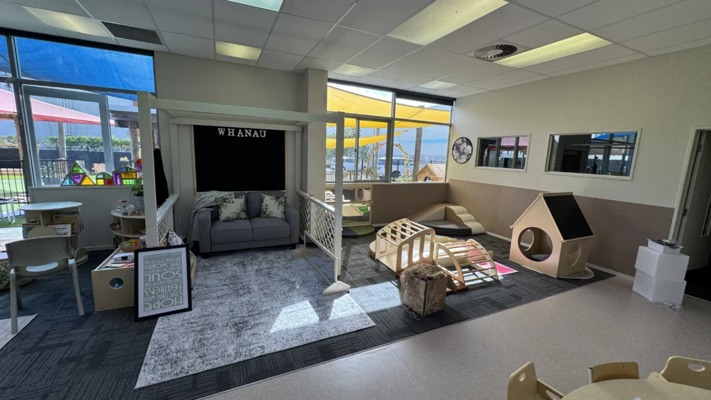
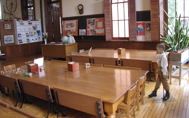
Imagine walking into a classroom where everything feels settled. The furniture is not just placed. It makes sense. Students know where to go, where to sit, and where to find what they need. There is space to move, areas to focus, and room to collaborate without constant reminders.
In reality, classrooms rarely come together that easily. Space is limited. Furniture has to serve multiple purposes. Over time, small adjustments get layered on top of one another, and what once worked starts to feel crowded, noisy, or harder to manage. The room may look fine, but transitions feel slower and students seem more distracted than they used to.
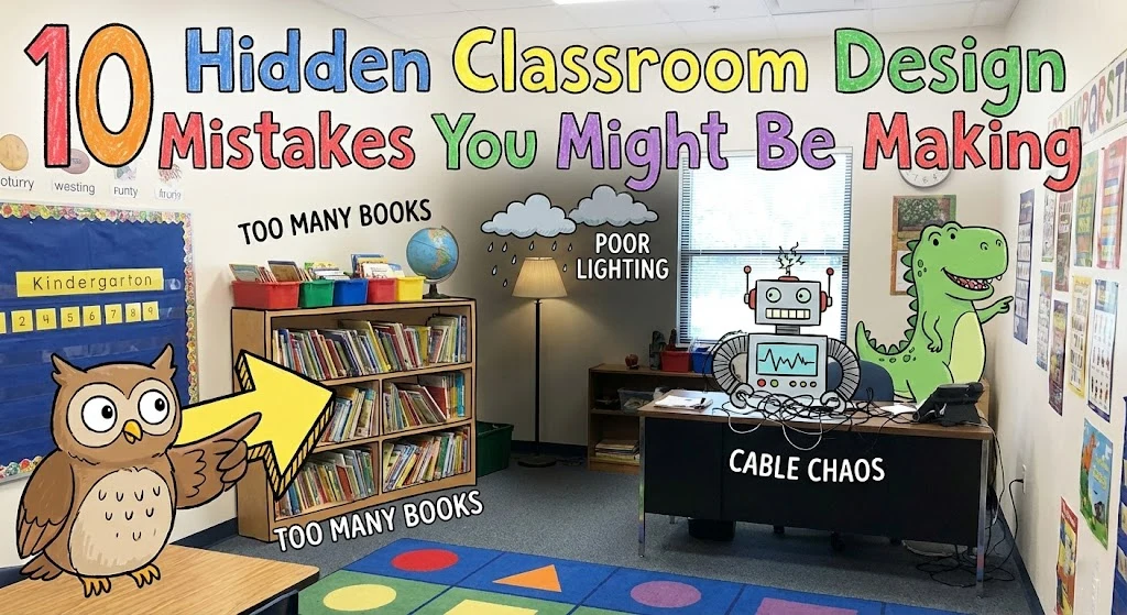
The encouraging part is that most layout problems are not dramatic design failures. They are small, common mistakes that can be corrected with thoughtful changes. The following ten classroom design mistakes are easy to overlook, but once addressed, they can significantly improve how your space functions every day.
Mistake #1 Designing Without a Clear Spatial Strategy
Many classrooms are arranged around furniture instead of learning goals. Tables are placed where they fit, shelves line empty walls, and centers are created simply because there is space. The room may look organized, but it lacks clear direction.
When a layout has no spatial strategy, students struggle to understand how the space is meant to function. Quiet work areas sit next to noisy activity zones. Group tables interrupt traffic flow. Open areas exist without a defined purpose. Teachers end up giving constant reminders because the environment itself is not communicating expectations.
A well-designed classroom should guide behavior naturally. Clear spatial planning reduces confusion, supports independence, and makes transitions smoother. Without it, even strong instruction feels harder to deliver.
fix:
- Identify the main learning activities before placing any furniture.
- Separate high-energy areas from quiet concentration zones.
- Make each section of the classroom visually and functionally distinct.
- Adjust the layout until movement and supervision feel intuitive.
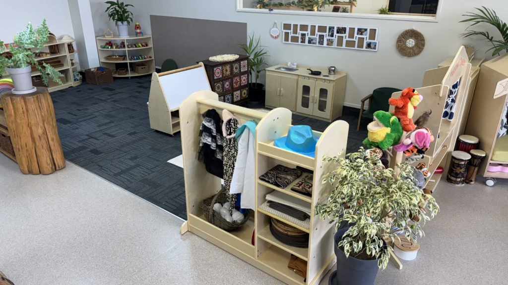
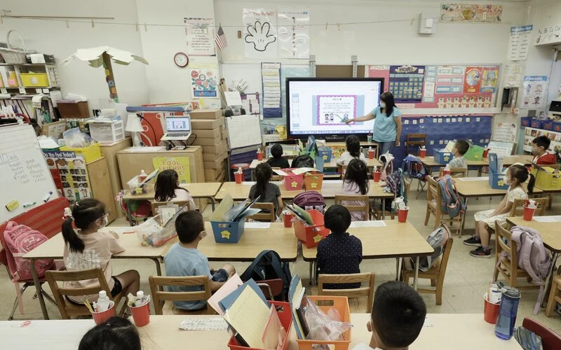
Mistake #2 Overcrowding the Classroom
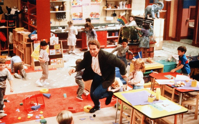
Overcrowding does not always mean a classroom is small. It often means there is too much furniture competing for space. Extra shelves, unused cabinets, oversized tables, and decorative pieces slowly fill the room until movement feels restricted.
When space is tight, transitions become chaotic. Students bump into chairs, squeeze between tables, and struggle to gather materials. Even minor movement requires negotiation. This increases frustration and distraction, especially during group activities.

Overcrowding also creates visual noise. A room packed with objects feels busy and overstimulating, which can affect focus and behavior. Teachers may spend more time managing movement and conflicts than facilitating learning.
A classroom needs breathing room. Open space supports flexibility, smoother transitions, and better supervision.
fix:
- Remove furniture that is rarely used or duplicates another function.
- Choose multi-purpose or modular pieces instead of single-use items.
- Maintain clear open floor space for movement and whole-group activities.
- Reevaluate the layout each term to prevent gradual clutter buildup.
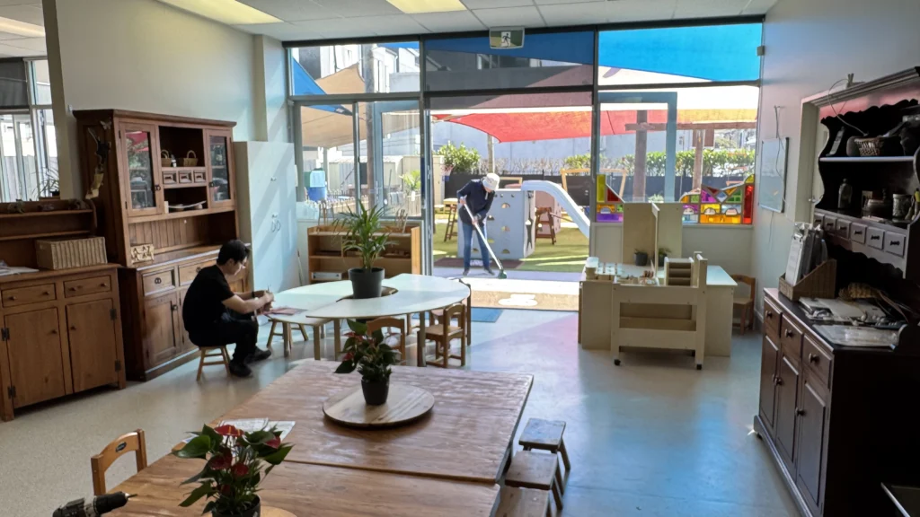
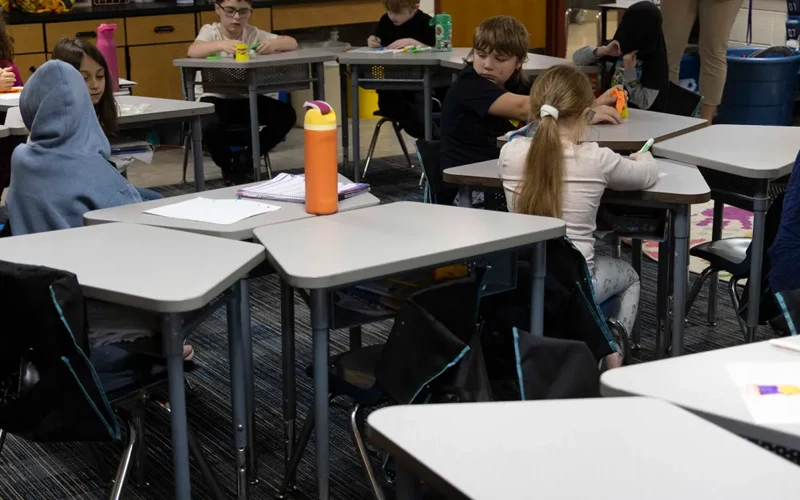
Mistake #3 Poor Traffic Flow and Blocked Pathways
A classroom can look neat and still function poorly if movement is not considered. Desks placed too close together, shelves positioned near entrances, or narrow walkways can create daily frustration. Students may have to squeeze past one another or take indirect routes just to move across the room.
When traffic flow is poorly planned, transitions slow down. Lining up takes longer. Gathering materials becomes disruptive. Minor congestion can quickly escalate into distractions or conflicts. Over time, this constant friction affects both classroom management and instructional time.
Clear pathways allow students to move confidently and independently. Good traffic flow also helps teachers monitor the entire room without obstacles blocking visibility.
fix:
- Keep main walkways wide and unobstructed, especially near doors and high-use areas.
- Arrange furniture to create natural movement paths rather than dead ends.
- Test transitions by walking common routes to identify bottlenecks.
- Avoid placing large furniture pieces in central traffic areas.
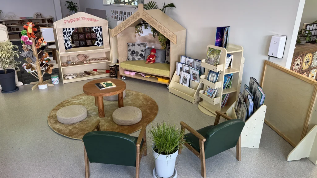
Mistake #4 Undefined or Blended Learning Zones
When learning zones are not clearly defined, the classroom begins to feel chaotic. Reading areas blend into play spaces. Group work overlaps with independent study. Without clear boundaries, students receive mixed signals about expectations.
This lack of definition affects focus. A child trying to read quietly may be distracted by nearby movement or noise. Students may wander between areas because the purpose of each space is unclear. Over time, this reduces independence and increases the need for teacher redirection.
Defined zones create structure. They help students understand where certain behaviors belong and support smoother transitions between activities. Clear spatial cues reduce confusion and make the classroom feel predictable and safe.
fix:
- Use rugs, low shelves, or furniture placement to visually separate activity areas.
- Keep high-energy zones away from quiet concentration spaces.
- Ensure each zone has a clear purpose that students can easily recognize.
- Adjust boundaries if activities consistently overlap or interrupt one another.
Mistake #5 Blocking Natural Light and Sightlines
Natural light is often overlooked when arranging classroom furniture. Tall shelves, cabinets, or decorative displays placed in front of windows can reduce brightness and make the room feel enclosed. Even partially blocked windows can change the overall atmosphere of a classroom.
Limited light affects more than appearance. Dim spaces can reduce alertness and make it harder for students to stay engaged. Poor sightlines also create supervision challenges. If large furniture blocks visibility across the room, teachers may struggle to monitor behavior effectively.
An open, well-lit classroom feels more inviting and easier to manage. Light and visibility support both mood and safety.
fix:
- Keep windows clear of tall or bulky furniture whenever possible.
- Arrange shelves and storage along walls that do not block natural light.
- Use multiple soft light sources to brighten darker corners.
- Ensure clear sightlines so every area of the room is visible from key positions.
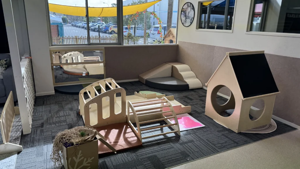
Mistake #6 Using Furniture That Doesn’t Fit Children’s Size
Furniture that is too large, too high, or too heavy creates daily barriers for students. Shelves placed out of reach, chairs that leave feet dangling, or tables that sit too high reduce comfort and independence. These small mismatches add up over time.
When children cannot easily access materials, they rely more on adults for simple tasks. This slows down transitions and limits ownership of the learning environment. It can also affect posture and focus, especially during longer work periods.

A classroom should be built around the students who use it. Age-appropriate furniture supports independence, confidence, and smoother routines.
fix:
- Select tables and chairs designed specifically for the age group you teach.
- Use low, open shelving so students can access and return materials independently.
- Check that seating allows feet to rest comfortably on the floor.
- Reassess furniture sizing as students grow or class composition changes.
Mistake #7 Choosing Bulky or Complex Furniture Designs
Furniture with oversized frames, decorative shapes, or unnecessary structural features can limit flexibility. Heavy tables are difficult to move. Unusual legs or protruding parts reduce usable space and may even create safety concerns.
When furniture is hard to reposition, the classroom becomes rigid. Teachers may avoid rearranging the room because it takes too much effort. This reduces the ability to adapt the space for different activities, group sizes, or teaching approaches.
Simple, functional design supports long-term flexibility. Classrooms work best when furniture can be adjusted quickly and safely as needs change.
fix:
- Choose lightweight furniture that can be moved without strain.
- Prioritize simple shapes with rounded edges for safety and usability.
- Avoid overly decorative elements that reduce flexibility.
- Test whether furniture can be rearranged easily for different learning setups.
Mistake #8 Creating Collaboration Spaces That Don’t Encourage Collaboration
Simply placing students at the same table does not guarantee collaboration. Long rows of desks or tables pushed together without thoughtful positioning can still limit interaction. If students are facing forward or sitting too far apart, meaningful discussion becomes less likely.
Poor collaboration setups reduce peer engagement. Students may complete tasks individually even when group work is intended. Teachers may need to prompt interaction constantly because the layout does not naturally support communication.
True collaboration requires visibility, proximity, and flexibility. The physical setup should make conversation and shared problem-solving feel natural, not forced.
fix:
- Arrange tables in small clusters that encourage face-to-face interaction.
- Keep group sizes manageable to support balanced participation.
- Allow seating to be easily rearranged for different activities.
- Position collaborative zones where discussion will not disturb quiet areas.
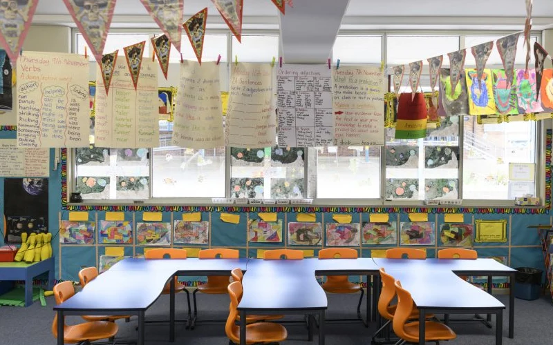
Mistake #9 Overloading Walls with Visual Stimuli
Classroom walls are often filled with posters, charts, student work, and bright decorations. While the intention is to create an inspiring space, too many visuals can overwhelm students. When every surface competes for attention, focus becomes harder to maintain.
Excessive visual input creates cognitive distraction. Students may glance around instead of concentrating on tasks. Bright colors and dense displays can also increase sensory stress for some learners. On the other hand, completely blank walls can make a space feel sterile and uninviting.

Balance is key. Visual elements should support learning, not compete with it. Thoughtful displays can reinforce instruction while maintaining a calm environment.
fix:
- Leave a portion of wall space intentionally clear to reduce visual clutter.
- Display materials at students’ eye level for accessibility and relevance.
- Rotate posters and student work instead of displaying everything at once.
- Choose cohesive color schemes rather than mixing too many bright tones.
Mistake #10 Ignoring Sensory and Emotional Regulation Needs
Every classroom contains students with different sensory preferences and tolerance levels. Some are sensitive to noise, bright light, or busy patterns. Others need movement or tactile input to stay alert and focused. When layout decisions ignore these differences, the environment can quietly work against learning.
Harsh lighting, constant background noise, tightly packed seating, or intense color schemes may lead to restlessness or withdrawal. Teachers may interpret these reactions as behavior problems, when the real issue is environmental overload. At the same time, a space with no movement options can make it difficult for active learners to regulate their energy.

A classroom does not need to be redesigned completely to become sensory-aware. Small adjustments can significantly improve comfort and focus. When students feel physically regulated, they are more likely to stay engaged and manage transitions successfully.
fix:
- Create a quiet area where students can reset without leaving the room.
- Use soft lighting or multiple light sources instead of relying solely on harsh overhead lights.
- Offer flexible seating options that allow subtle movement.
- Minimize background noise with rugs, soft materials, or felt pads on furniture.
- Choose calming color palettes and avoid overwhelming visual patterns.
Abschluss
A classroom does not have to be perfect to be effective. What matters most is whether the space supports how students actually learn, move, and interact. When pathways are clear, zones are purposeful, and furniture fits the needs of the children using it, the entire day runs more smoothly. Small adjustments often create noticeable improvements.
Many classroom design mistakes develop gradually. A table is added here. A shelf is moved there. Over time, the room shifts away from its original intention. Taking the time to reassess your layout can reveal simple opportunities to improve flow, focus, and independence without starting from scratch.
If you are planning a new classroom or reconsidering your current setup, start with one change. Redefine a zone. Clear a pathway. Adjust lighting. Evaluate furniture placement through your students’ eyes. Intentional design decisions today can prevent daily frustrations tomorrow.
If you need additional guidance, consider consulting classroom design specialists or exploring flexible furniture solutions that support long-term adaptability. The right support can help you create a space that works with your teaching style rather than against it.
Your classroom layout influences every lesson, every transition, and every interaction. Make it a tool that strengthens learning, not a barrier that slows it down.
Need Help Rethinking Your Classroom Layout?
Book a short 1:1 planning session and share your space size, age group, and budget range. Our team will help you refine your layout, recommend flexible furniture solutions, and create a classroom setup that supports focus, collaboration, and independence from day one.