Specify furniture color first — paint can wait
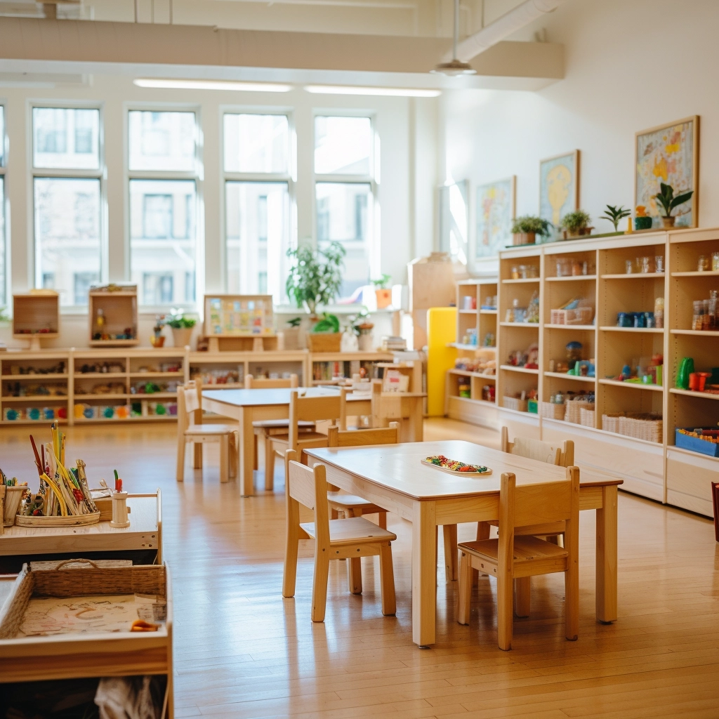
If you are fitting out a classroom, the tables, chairs, cubbies, and shelves you buy this year set the palette children will live with. Walls can be painted later. Soft wood plus muted accents by zone keeps the room usable. Send photos or a floor plan and we will return a color-matched furniture list.
Classroom colors play a bigger role in preschool learning environments than many people realize. The colors used on walls, furniture, and learning areas can influence how children feel, how easily they focus, and how comfortable they are throughout the day. A well-balanced classroom color scheme can help create a space that feels calm, welcoming, and supportive for young learners.
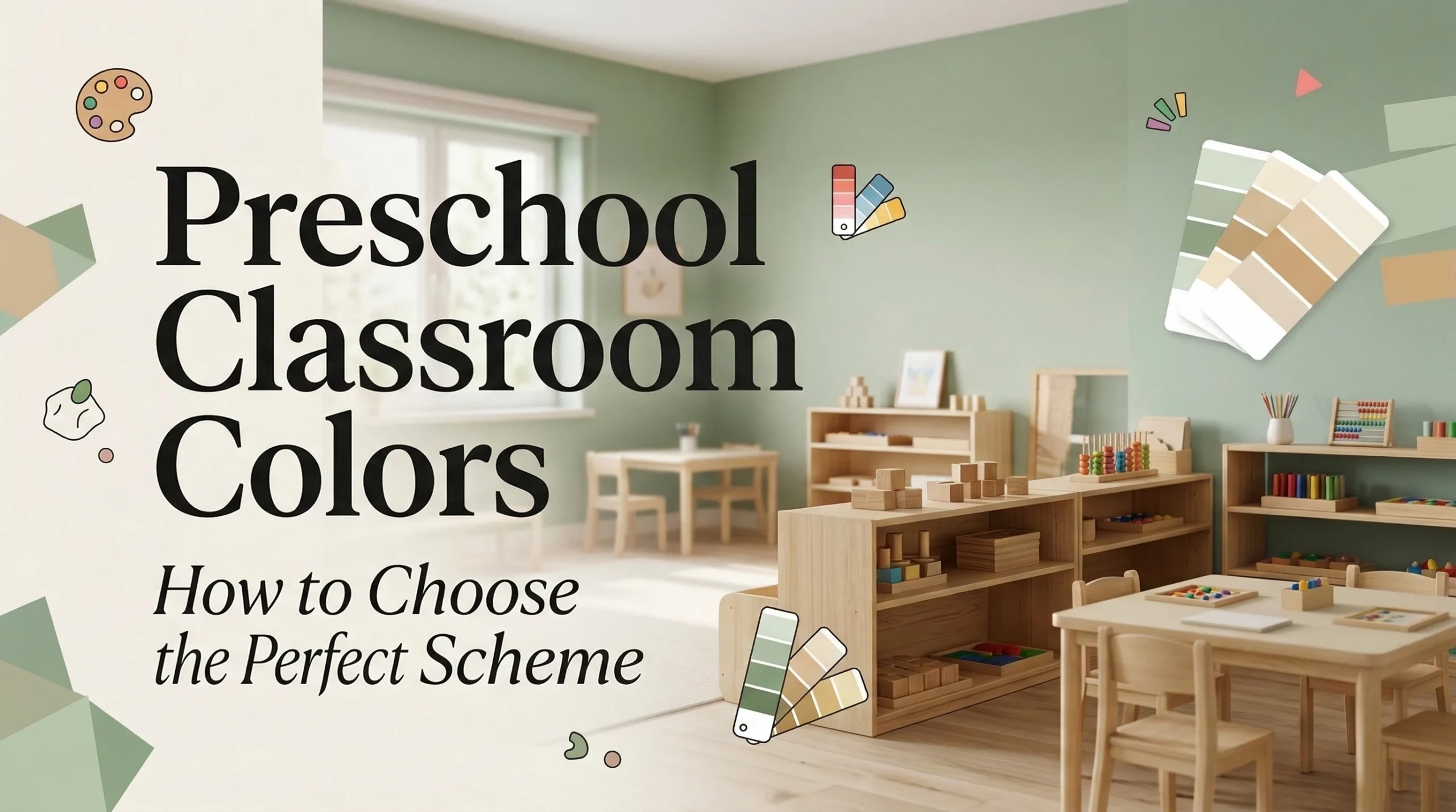
However, choosing the right classroom colors is not always easy. Preschool classrooms already contain many colorful materials, so the overall palette needs to stay balanced rather than overwhelming. In this guide, we’ll explore why classroom colors matter, the factors to consider when choosing them, and the best color ideas for creating a supportive preschool learning environment.
Why Classroom Colors Matter in Preschool Settings?
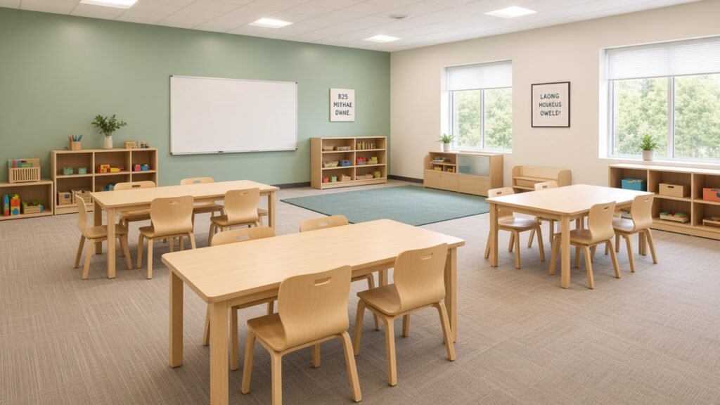
Classroom colors are more than decoration. In preschool environments, color becomes part of the learning atmosphere that surrounds children every day. The shades used on walls, furniture, and classroom materials can influence how children feel, how easily they focus, and how comfortable they remain throughout the day. Because preschoolers are still developing emotional regulation and attention skills, the visual environment plays a significant role in shaping their learning experience.
Thoughtful classroom colors can help create a space that feels welcoming, organized, and calm. Instead of competing with learning materials, well-chosen colors support the overall environment and help children feel ready to explore and participate.
Colors influence mood, attention, and behavior
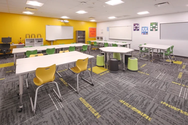
Different colors create different emotional responses. Bright, highly saturated colors can feel energetic, but when used too heavily they may increase distraction and visual overload. In preschool classrooms, where children already interact with toys, artwork, and displays, too many strong colors can make the room feel chaotic.
This is why calming classroom colors are often recommended. Soft blues, muted greens, and warm neutrals help create a more balanced environment. These tones reduce visual stress and make it easier for children to concentrate on activities, conversations, and instructions. When teachers think about color for learning, the goal is not to make the room as colorful as possible, but to create a space that supports focus and emotional comfort.
Young children are highly sensitive to visual environments
Preschool children react more strongly to their surroundings than older students. Their brains are still learning how to process sensory information, which means the classroom environment can greatly influence their mood and behavior.
Because preschool classrooms already contain many colorful objects, the background colors should provide balance rather than additional stimulation. Good colors for classrooms work quietly in the background, allowing books, toys, and learning materials to stand out. When the overall color palette feels calm and organized, children often find it easier to settle into routines, stay engaged in activities, and feel comfortable in the classroom.
What Makes the Best Classroom Colors for Preschool
The best classroom colors for preschool are not simply the brightest or most playful ones. In early childhood spaces, color should support comfort, focus, and emotional security. Because preschool classrooms already contain toys, books, displays, and student artwork, the overall palette should create balance rather than add visual pressure. The most effective classroom colors usually combine soft bases, gentle warmth, and a few controlled accents.
Soft colors help create a calm learning environment
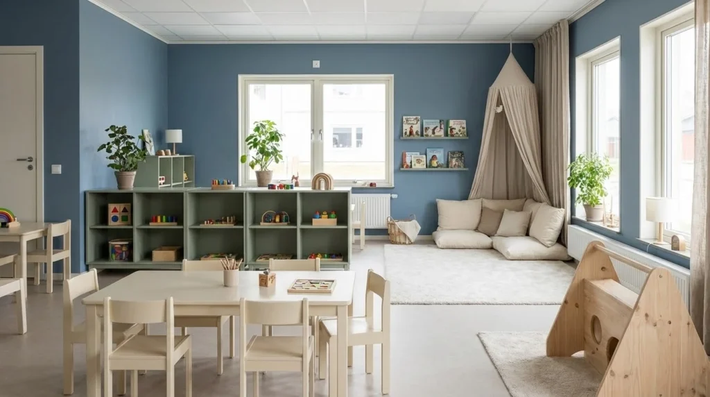
Soft tones often work better than highly saturated shades in preschool classrooms. Colors such as muted blue, sage green, warm beige, and soft cream help children feel comfortable and settled. These soothing classroom colors create a gentle atmosphere that supports focus and emotional stability.
Examples of soft preschool classroom color combinations include:
- Soft blue and warm white create a peaceful and open classroom atmosphere
- Sage green and cream feel natural and balanced, making them ideal for calm learning spaces
- Muted teal and light beige add color while still maintaining a relaxed tone
Neutral base colors reduce visual clutter
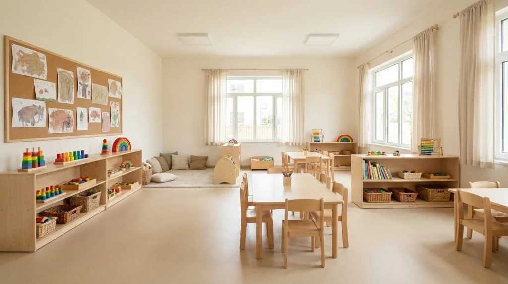
Preschool classrooms naturally include many colorful objects, from toys to learning displays. When the main classroom wall colors are neutral, the room feels more organized and less visually overwhelming. Neutral tones also allow educational materials and student artwork to stand out more clearly.
Examples of neutral classroom color schemes include:
- Warm white with natural wood tones creates a clean and simple classroom environment
- Light beige with soft gray accents keeps the room balanced and easy to decorate throughout the year
- Soft greige with muted green details offers a modern and calming look
Warm accents add energy without overwhelming children
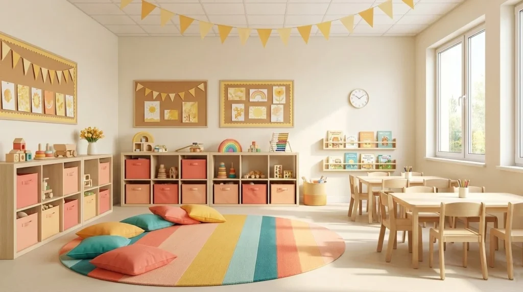
Warm colors can make a preschool classroom feel welcoming and lively when used carefully. Instead of covering large surfaces with bright colors, teachers can add warmth through smaller elements such as furniture, storage bins, rugs, or decorative borders.
Examples of warm accent combinations include:
- Neutral walls with soft yellow accents create a cheerful but balanced classroom
- Cream base colors with peach or coral details add warmth and friendliness
- Light beige with muted orange highlights introduces energy while maintaining harmony
Balanced color palettes make classrooms easier to manage
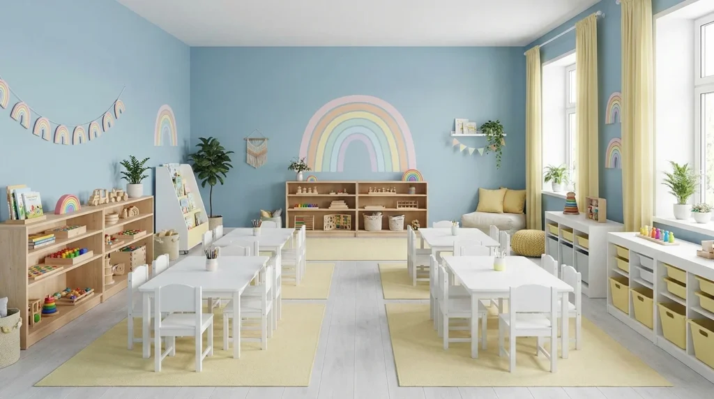
A practical preschool classroom color palette usually includes one calm base color, one supporting tone, and a few small accent colors. This structure helps the environment feel organized while still allowing creativity and seasonal decorations.
Examples of balanced preschool classroom palettes include:
- Light gray, pastel rainbow accents, and white furniture
- Soft blue, warm white, and pale yellow accents
- Sage green, cream, and natural wood tones
How Classroom Colors Should Change Across Learning Zones
A preschool classroom should not rely on one single color mood for the entire space. Different learning zones serve different purposes, so the color choices in each area should support the activity that happens there. When classroom colors change subtly across zones, the environment feels more organized and easier for children to understand.
Quiet areas need calmer and softer tones
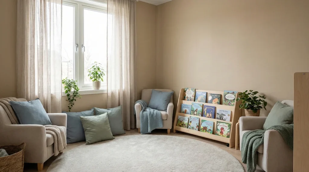
Reading corners, quiet spaces, and rest areas benefit from calmer classroom colors. Soft tones such as muted blue, sage green, and warm beige can help these spaces feel peaceful and comfortable. When children enter these areas, the gentle color palette naturally signals that this is a place for relaxing, reading, or calming down.
Activity zones can use slightly warmer tones
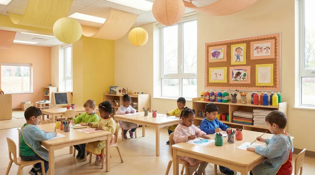
Art tables, collaborative areas, and play-based learning centers can handle a bit more visual energy. Slightly warmer classroom colors such as soft yellow, peach, or light coral can make these spaces feel lively and inviting. When used carefully, these warmer tones encourage participation without overwhelming the classroom.
Display areas need balanced and neutral backgrounds
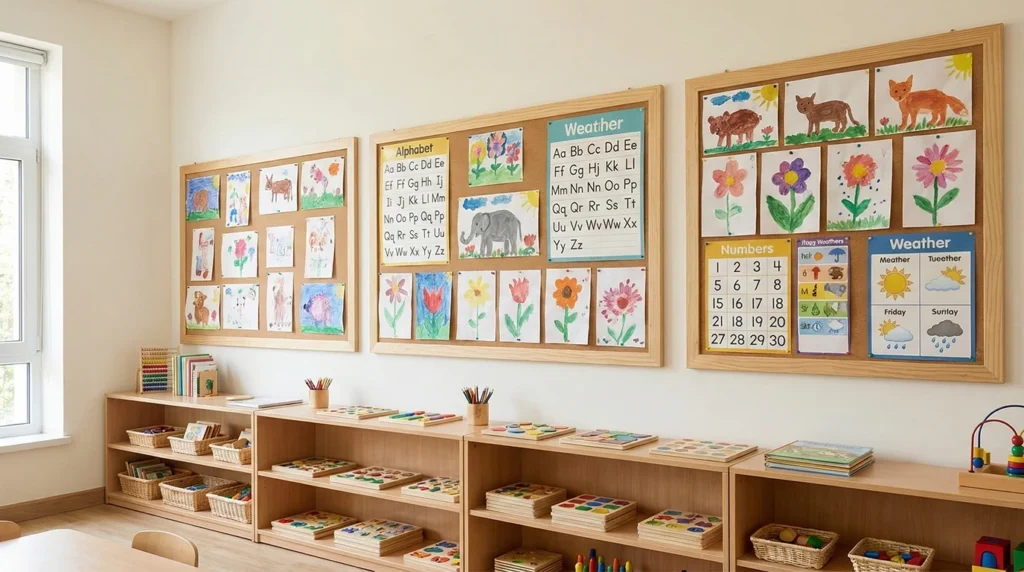
Walls that hold charts, schedules, labels, or student artwork already contain a lot of visual information. If the wall color is too strong, the space can quickly feel cluttered. Neutral classroom wall colors such as warm white, light gray, or soft cream help learning materials stand out while keeping the classroom visually organized.
Transition spaces should stay simple and consistent
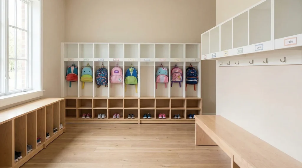
Entry areas, cubbies, and walkways connect the entire classroom environment. These spaces work best when their colors remain simple and consistent with the rest of the room. Soft neutral tones help create a smooth visual flow, making it easier for children to move between activities and understand how the classroom is organized.
How to furnish these color zones
- Quiet / reading: natural wood tables, muted chairs, a low bookshelf.
- Activity: slightly warmer tabletops, same height family.
- Entry and cubbies: put the accent color on lockers, not a painted wall.
- Floor: one calm rug family — toys already supply the bright layer.
Tables and chairs · Classroom bookshelf · Cubbies and lockers · Carpets and rugs
Common Preschool Classroom Color Mistakes to Avoid
Even when teachers have good intentions, preschool classroom colors can still go in the wrong direction. A room may look cheerful at first but feel distracting once children spend hours in it every day. That is why it is important to think beyond decoration and focus on how color actually functions in a learning environment.
Using too many bright colors at once
A preschool classroom does not need every wall, bin, rug, and display to be bold and colorful. When too many strong colors appear at the same time, the room can start to feel noisy and overstimulating. Bright colors work best when they are limited to smaller accents instead of covering every large surface.
Treating colorful as automatically better
Many people assume a colorful classroom is always more engaging for young children. In reality, too much visual excitement can make it harder for children to focus, settle down, and follow routines. The best classroom colors are not the loudest ones, but the ones that create a balanced and supportive space.
Ignoring the amount of color already in the room
Preschool classrooms already contain books, toys, posters, labels, and student artwork. If the walls and furniture are also highly saturated, the whole space can feel crowded very quickly. Good classroom color schemes take existing materials into account instead of adding even more visual stimulation.
Choosing trendy colors without thinking about daily use
A color palette may look beautiful in photos but still fail in a real preschool setting. Some trendy classroom paint colors look stylish online yet feel too cold, too dark, or too impractical for everyday learning. A successful preschool classroom color scheme should work well for children and teachers, not just for pictures.
Why a room looks “too colorful”: it is rarely the paint. It is mixed lots of tables, chairs, and cubbies from different suppliers. One supplier, one finish board.
Designing Better Preschool Classrooms with the Right Colors
You have the palette: a soft base and a few warm accents. To make the room usable, take three steps:
- Keep that palette (you just read why).
- Spec furniture finishes by zone: テーブルと椅子, cubbies, bookshelf.
- Send photos or the floor plan; we return the list within 24 hours. Or open the 2026 catalogues そして real projects.
FAQs About Preschool Classroom Colors
What are the best classroom colors for preschool?
In many preschool environments, colors that feel soft and natural tend to work best. Shades inspired by nature, such as muted greens, warm neutrals, and gentle blues, are often preferred because they feel comfortable to the eyes and do not compete with learning materials. These colors also work well as a background for toys, books, and classroom decorations, which already add plenty of visual interest to the space.
Should preschool classrooms use bright colors?
Bright colors can be useful when they are used intentionally. Instead of covering entire walls with bold shades, many classrooms introduce brighter colors through small elements such as storage bins, cushions, labels, or play materials. This approach keeps the classroom lively and engaging while maintaining a balanced visual environment.
Do classroom colors affect children’s behavior?
Research in educational environments suggests that visual surroundings can influence how children feel and respond in a classroom. Environments that feel visually balanced and organized often help children settle into routines more easily. When colors are used thoughtfully, they can support a sense of comfort and help reduce unnecessary visual distractions during learning activities.
How often should schools update classroom color schemes?
Most schools should not repaint often. Refresh the room with coordinated furniture finishes, cubbies, and storage — not seasonal wall DIY. See the 2026 catalogues or send room photos / a floor plan.
Request the preschool catalogue
If you are furnishing one room or a whole centre, request the 2026 catalogue or send photos for a color-matched list.